NEO
Neo is an open-source, community driven platform that is leveraging the intrinsic advantages of blockchain technology to realize the optimized digital world of the future.
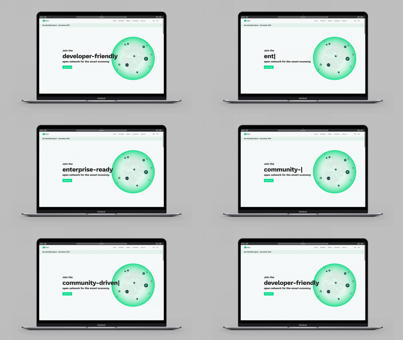
We used the third anniversary of the MainNet launch as an opportunity to debut the new Neo brand. The revamp includes an update to the logo, fonts, and brand colors, which are outlined in the Neo Brand Book. Updates to the Neo logo have been made across its social media accounts.
Logo Overview
Neo’s branding is a graphical representation of Neo’s vision and identity. While depicting the first letter of the Neo logo, the Neo doorway also symbolizes Neo’s role as the connection to the smart economy. Its colors are carefully
chosen to illustrate two important characteristics of the Neo blockchain: young and evergrowing. Inspired by latest graphic design trends, lowercase letters are used in the logo to deliver a smooth, non-intrusive and consistent user experience. This modern and contemporary logo is optimized for usage in digital contexts and helps Neo to stand out in a cluttered blockchain marketspace
chosen to illustrate two important characteristics of the Neo blockchain: young and evergrowing. Inspired by latest graphic design trends, lowercase letters are used in the logo to deliver a smooth, non-intrusive and consistent user experience. This modern and contemporary logo is optimized for usage in digital contexts and helps Neo to stand out in a cluttered blockchain marketspace

Exclusion Zone
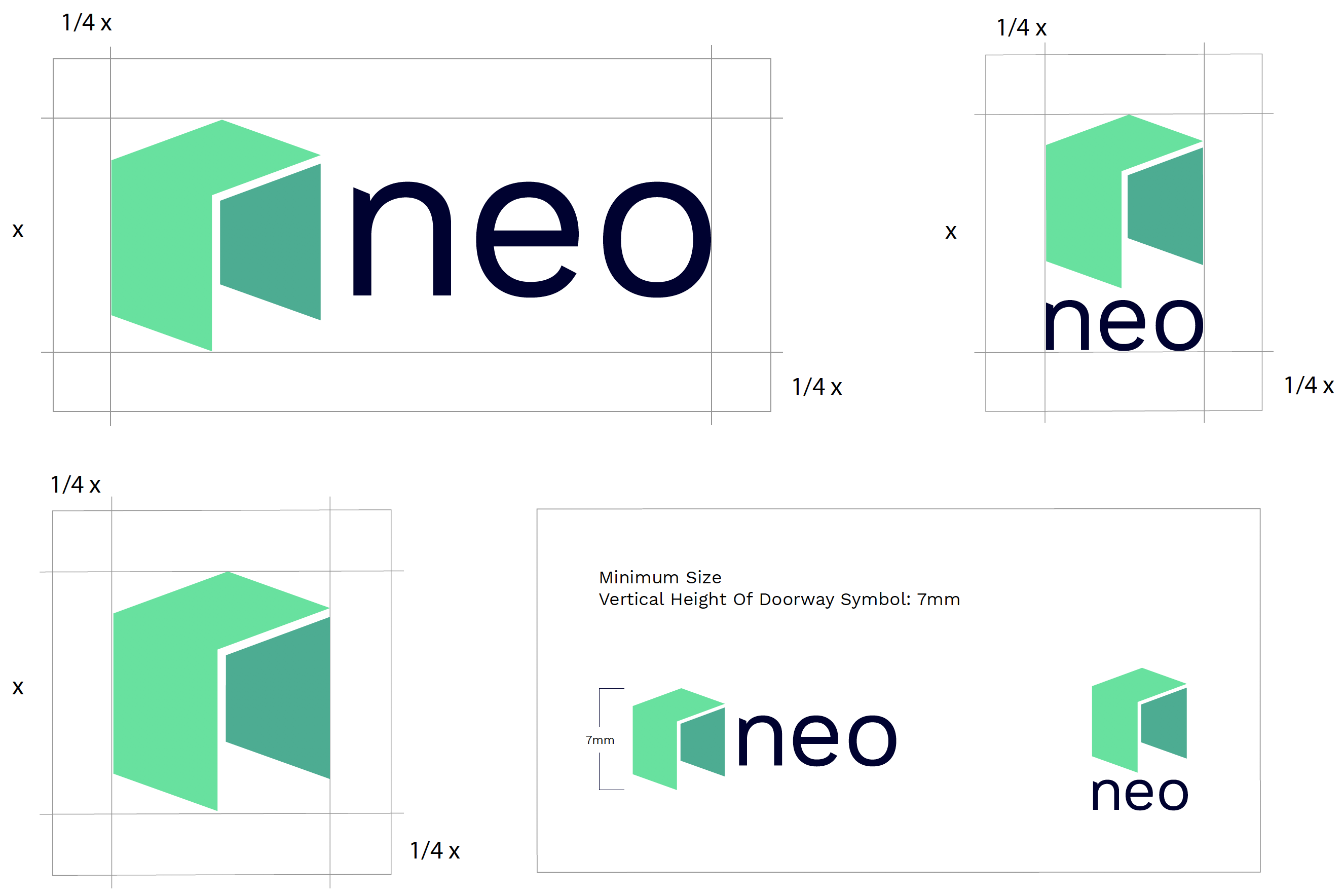
Here are the guidelines for the use
of the exclusion zones (clearance
space) around the logo, as well as
the minimum sizes to be used for horizontal and vertical logos.No
graphic element should be placed
within the exclusion zones.
Minimum sizes have been set
according to legibility and clarity.
of the exclusion zones (clearance
space) around the logo, as well as
the minimum sizes to be used for horizontal and vertical logos.No
graphic element should be placed
within the exclusion zones.
Minimum sizes have been set
according to legibility and clarity.
Color Palette
The color palette is essential for
building awareness and association
with the Neo branding and should be consistently applied across all communications. Always match the
colors to the Pantone, CMYK, and
RGB color guide specified on this
page. The secondary palette adds flexibility to the palette and range
to the system. These colors are recommended to break up large
fields of primary colors.

Icon Samples
Here are samples for icon designs,
with the Neo branding style.
with the Neo branding style.
Website Detail
Neo website home page

Website Detail
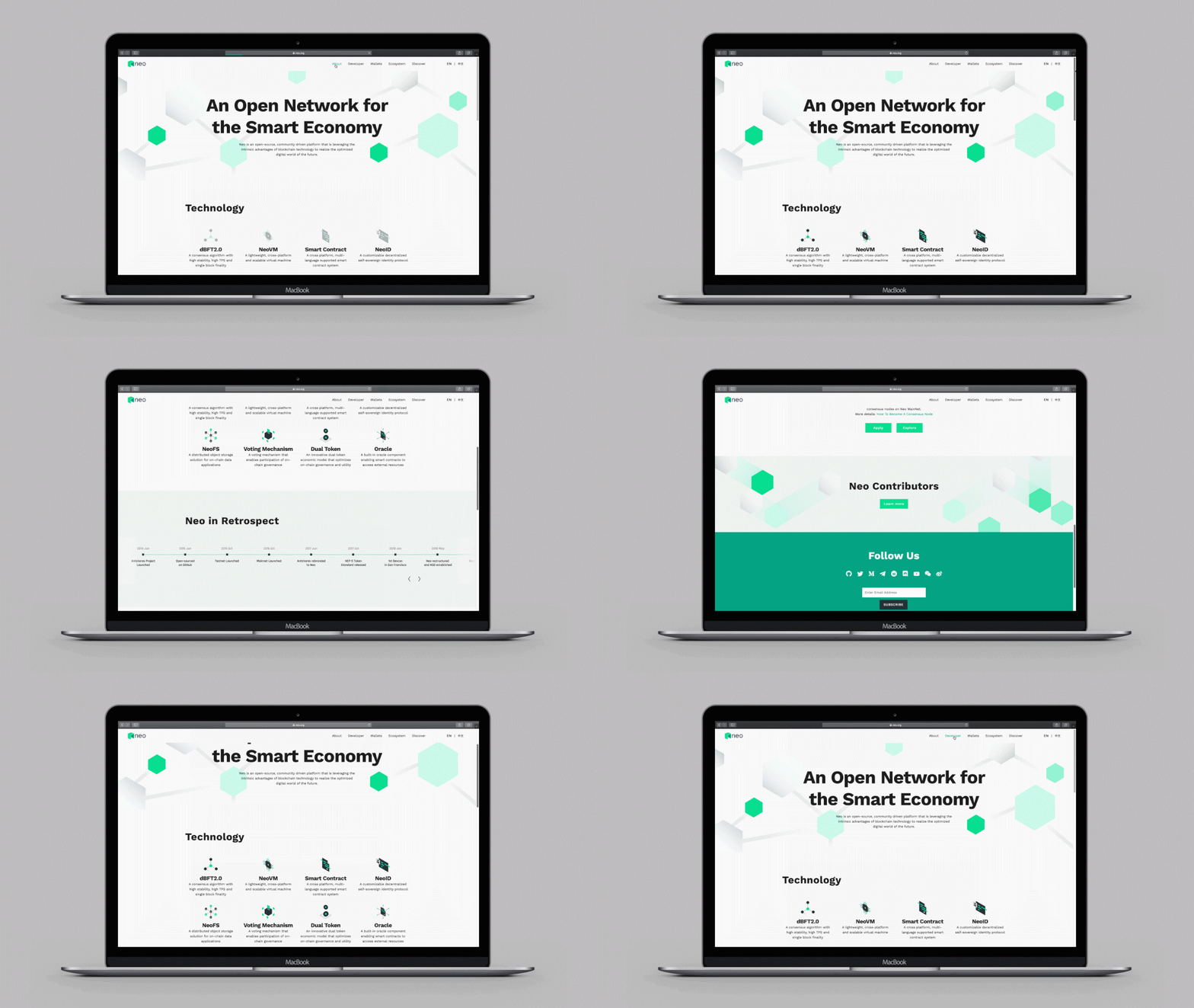
Neo website about page
Website Detail
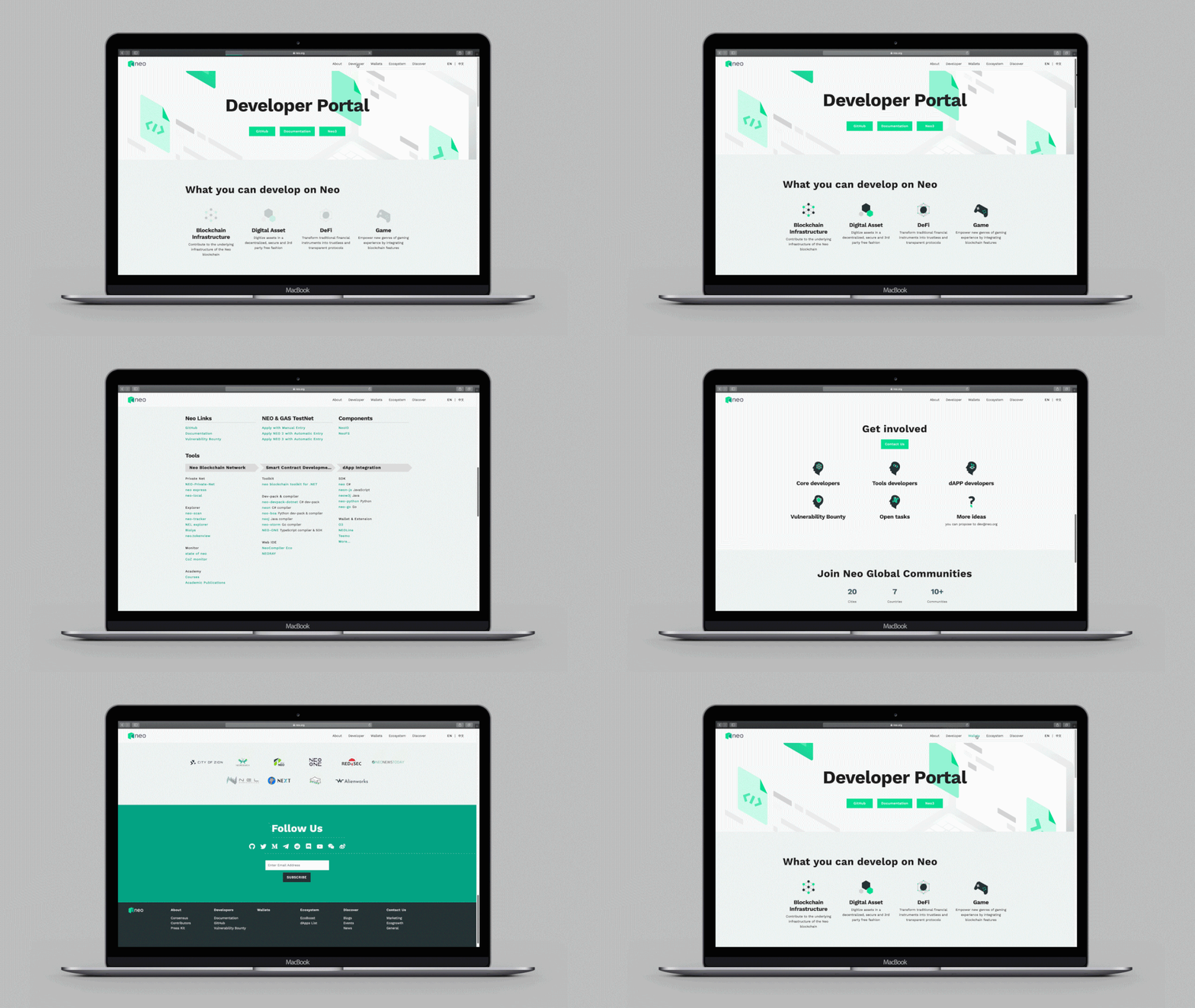
Neo website developer page
Website Detail
Neo website wallet page

Website Detail
Neo website ecosystem

Website Detail
Neo website discover page

Website Detail
Neo website
Chinese version
Chinese version

Project Credit
Project lead: Kaki Law, Kurt Feng
Designer: Jennifer Tan, Felix Fu